Packing Guidelines – Mercari
Because of the marketplace's focus on amateur sellers, Mercari faces unique challenges in ensuring quality C2C interactions ... particularly when it comes to shipping – a responsibility which lies on the individual user.
• Over-packed items have increased shipping costs to users and the company alike.
• Under-packed items have higher risk of damage, again, increasing costs to users and the company.
• The intimidation of packing items for shipping scares off potential sellers, which limits inventory and overall revenue.
We decided to address these problems with an interactive packing guide, making expert-knowledge available to every seller.
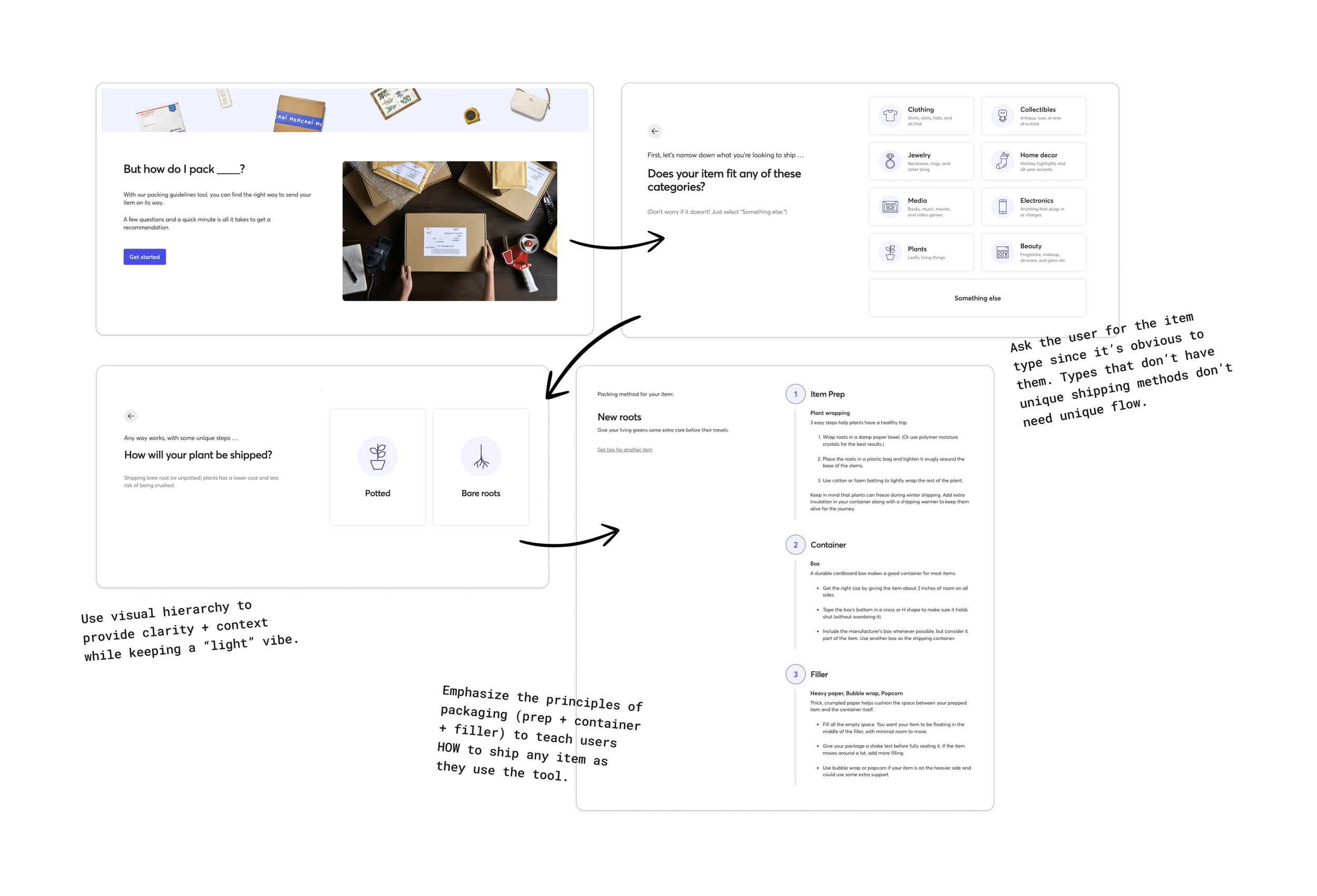
Users select from 9 basic categories and answer a question or two more to get specific recommendations for materials and methods for their item.

With an almost infinite array of sellable items, a simple structure was not immediately obvious.
Our goal was to create an easy, breezy, and short journey through the countless variables that factor into packing methods.
As always, my approach was to analyze the problem space, construct sound information architecture, and then layer the copywriting craft over it.
When I entered the project, the working team was struggling to present choices about item dimensions to users. The hope was for UX Content to tweak some phrasing and solve the problem.
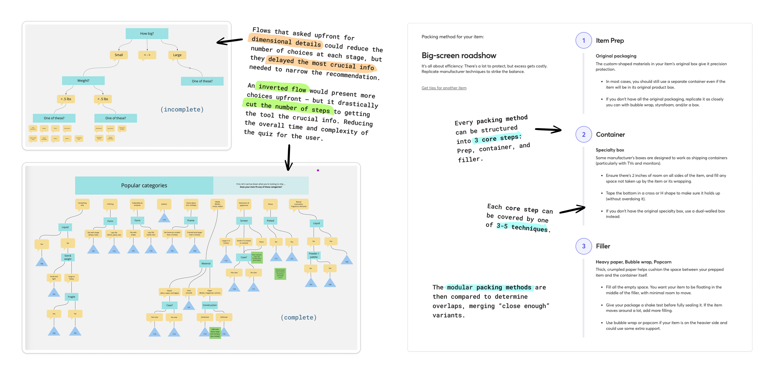
Studying the information gap, I discovered the question flow around dimensions was a symptom of a deeper flaw that would continue to nag the project as it advanced forward.

A critical discovery: Packing methods were not dependent on dimensionality.
Dimensionality was sometimes a factor in variant selection, but rarely – and it was often dependent on the specific item type. If a specific form of dimensionality would only be a factor in 1 out of 60 item categories, it was a wasteful and irrelevant ask of all users – especially since it requires measurement on the user's part.
We could drastically simplify the overall flow by inverting its logic.
Since the importance of item types meant we'd always have to ask users about them at some point in the flow, I explored the viability of starting with this prompt. Hundreds of selections at this stage would make it unviable. But if I could find a way to narrow the selection down efficiently, the weight on the user (and us on the production side) would be a small fraction of the cursory concept.
Gathering data with Product Management and Customer Experience (Mercari's support team), we parsed where it was crucial to provide unique guidance – based on a combination of cost of filed claims and their occurrence rates. After developing a modular taxonomized structure for packing methods, I determined that they could be distilled down to about a dozen variants total.
Further scenario mapping was able to refine the flow so that the first step would present only 9 choices and each of those choices would have 0-3 follow-up questions.
We'd found our breakthrough moment, reducing the overall complexity of the project by at least 90%.

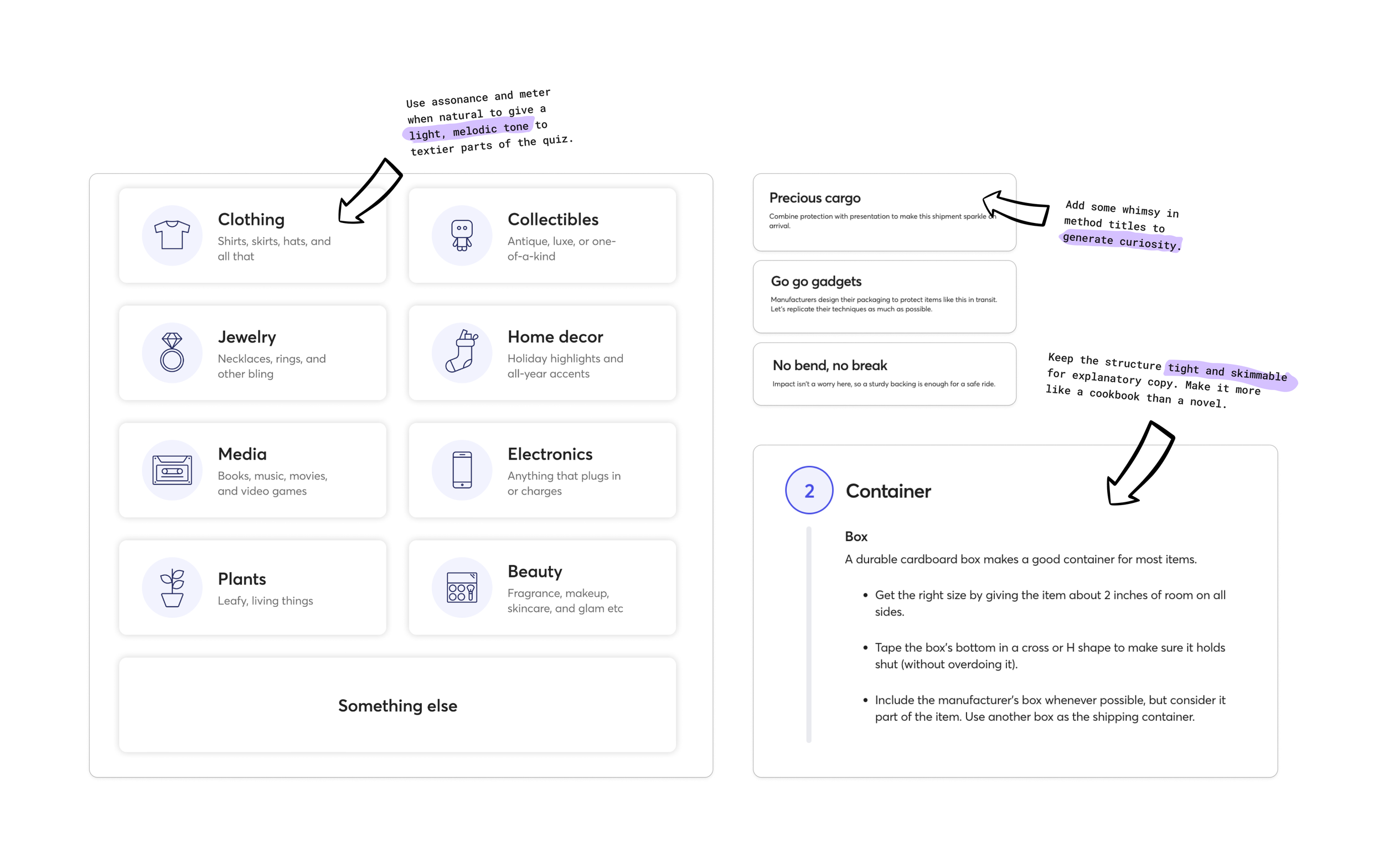
At this point, I applied copy craft onto the infrastructure, minimizing cognitive load on the user and making the experience "pop."
While some number of steps and technical explanation would be unavoidable, I utilized a swathe of copywriting tools to minimize any feeling of intimidation.
For that initial set of 9 selections, I'd work with my UX Design partner to blend visual hierarchy and a light-but-informative copy tone to make the choice as clear and easy for the user as possible.
All in all, we were able to reduce the project timeline by several sprints, launching in time for the busy holiday ordering season, giving Marketing a key product feature to promote seller growth, and improving results for sellers utilizing the tool.