
Navigational IA
Mercari roots its value proposition in its ease of use. Like any expanding product platform, however, every addition to its system adds complexity.
UX hypothesized that the diminishing impact of feature launches might indicate the existing navigational information architecture could not support the platform's growing scale. I partnered with a UX Researcher to investigate the problem, and then put together a wider cross-functional team to devise a solution based on what we discovered.
We quickly realized just how big an undertaking this would be ...
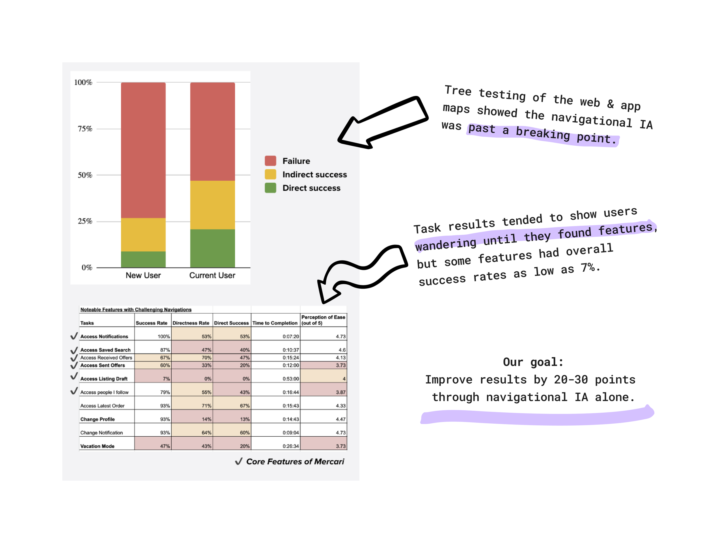
While Mercari users perceive the platform as easy, they showed trouble accessing key features.
The results were a bad sign for how well we were achieving the easy experience Mercari prided itself on.
But our hypothesis gained validation. That was a great sign for what the project might be able to achieve. Analyzing the data against the actions we could take, we believed we could make substantial gains.
This would not only improve the existing business but provide a more fertile landscape for the next wave of big new features.
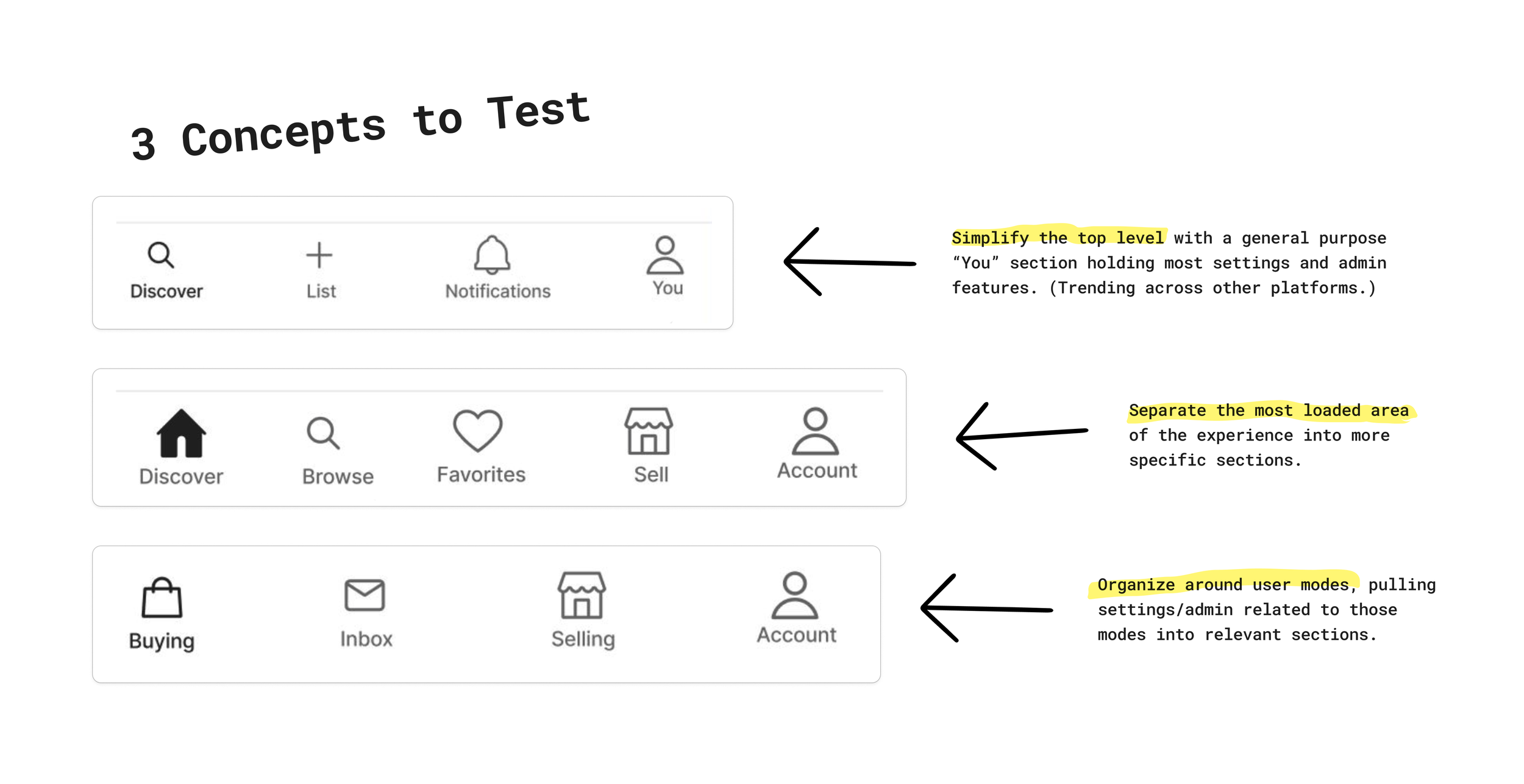
We developed three concepts, each responding to our user data from a distinct perspective.
Based on follow-up studies, heuristic evaluation, and competitive trends, our cross-functional team crafted three unique models to test against the existing experience.
Within these models, our core team mapped every existing feature, all roadmapped releases, recently removed features, plus prevalent long-term concepts. We wanted to make sure any investment in navigational IA could sustain the platform well beyond its current state.
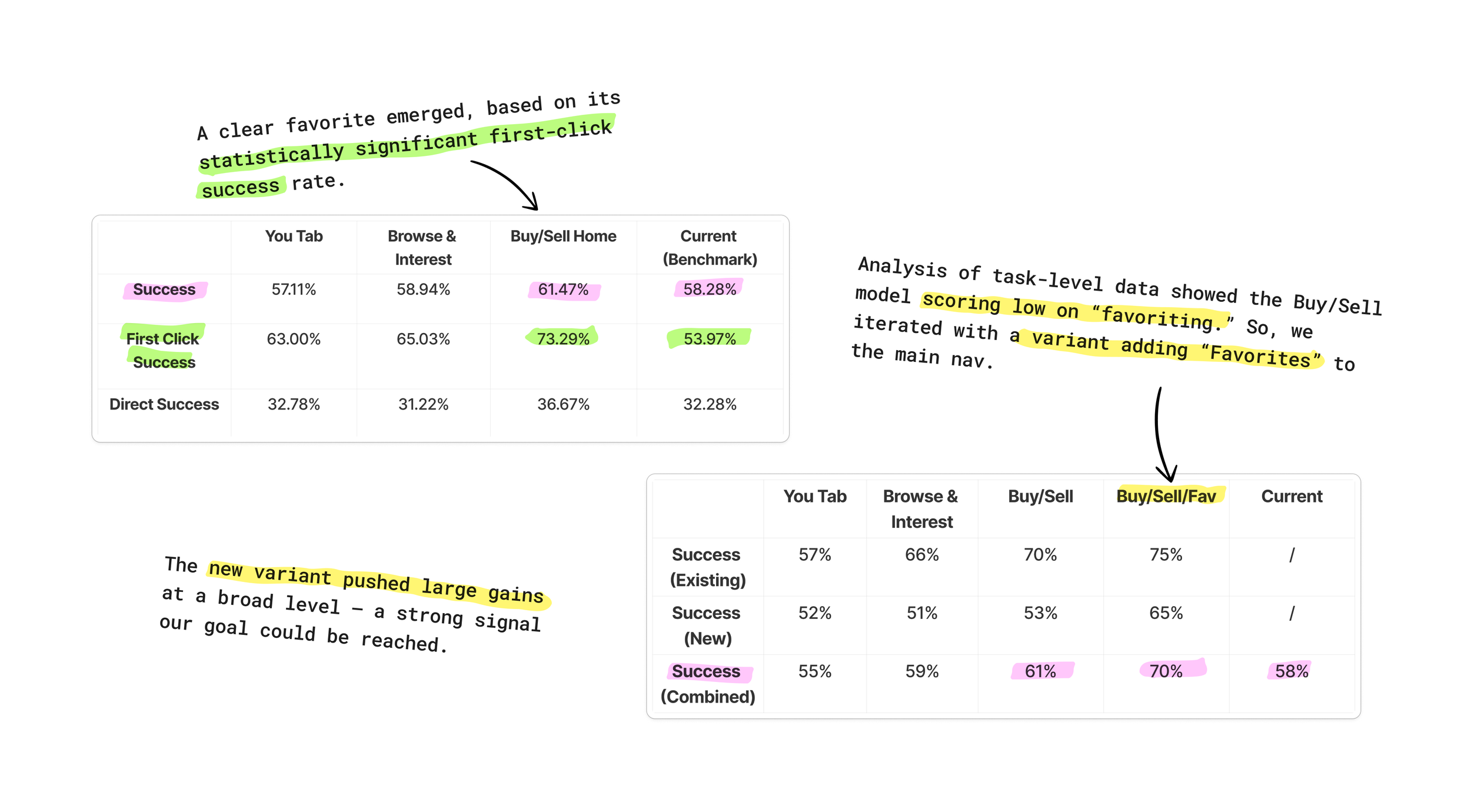
With a sly iteration, we hit a "Eureka!" moment.
The top-level results weren't the only story.
Throughout the testing process, we'd carefully balanced user tasks and deeper navigation flows between the concepts, ensuring we'd get enough data to understand if particular pieces of any proved particularly successful (or detrimental). This would allow us to remix components of the concepts and create an optimized final variant.
Sure enough, we were able to pinpoint the weaknesses of the models in comparison to each other, and we were able to adjust our leading concept to further improve its performance.
With a no-questions champion on the table, we moved to exploring the copy & design patterns that would refine the raw architecture.
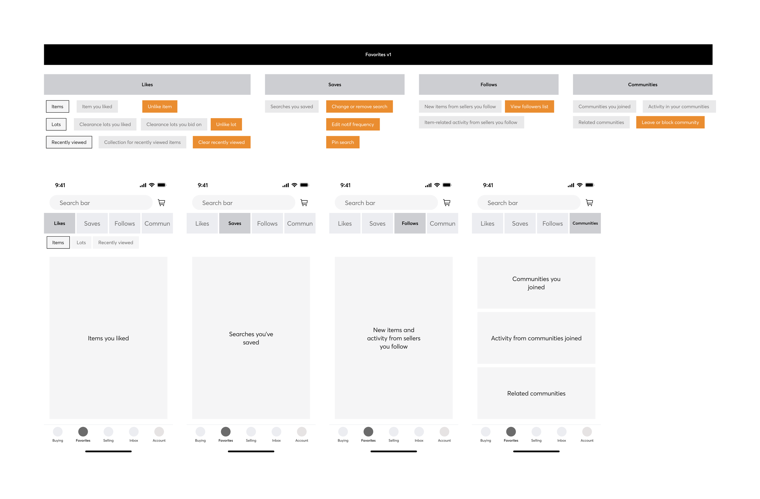
Taxonomy labeling and UI structure finalize the gains (and further boost them) .
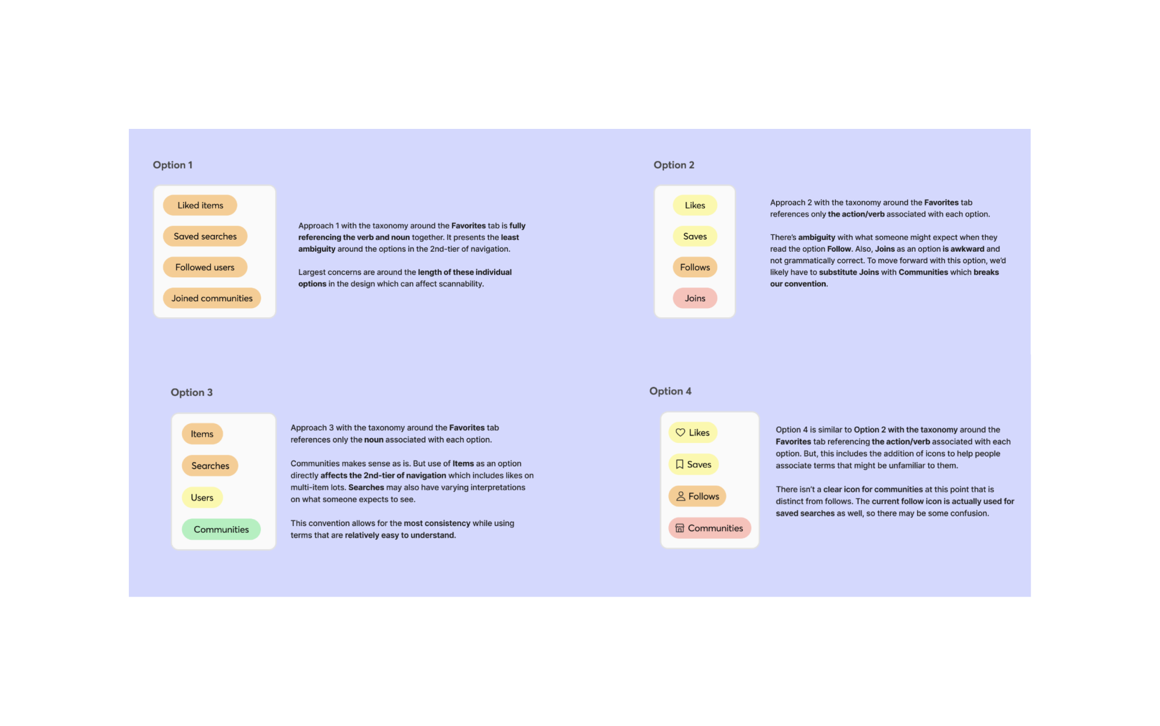
The original tree-testing had been based on the current product experience's taxonomy and UI. So, in order to cement the gains – and fully maximize them – we built experimental variants for how the navigational IA would be presented to users.
With my lead, this entailed a tight collaboration between Design, Research, and Content. Even as each specialty developed the optimal vision based on its own expertise, we had to carefully coordinate concepts to ensure a cohesive whole that would provide concrete data.
The bold-but-methodical approach to the concept and its well-evidenced improvements gained the project a top prioritization slot for the next fiscal year.